The Colour Set That Is Reputed To Define Interior Design in 2026
Table of Contents
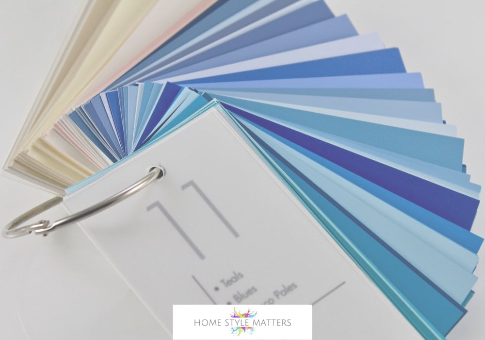
As 2026 approaches, interior designers and industry experts suggest the next big colour set will revolve around Deep Teal, Navy, and Atmospheric Blues with Violet undertones. These rich shades may become the defining paint colours of the year, offering depth, drama, and a sense of grounding.
Unlike the muted neutrals of recent years, this Blue palette feels bold yet timeless—perfect for living spaces, dining rooms, and even a restful bedroom. According to trend predictions for the year, these shades could feature heavily in interior trends across both modern and classic homes.
Why These 2026 Colours May Prove to be Popular in Interior Design
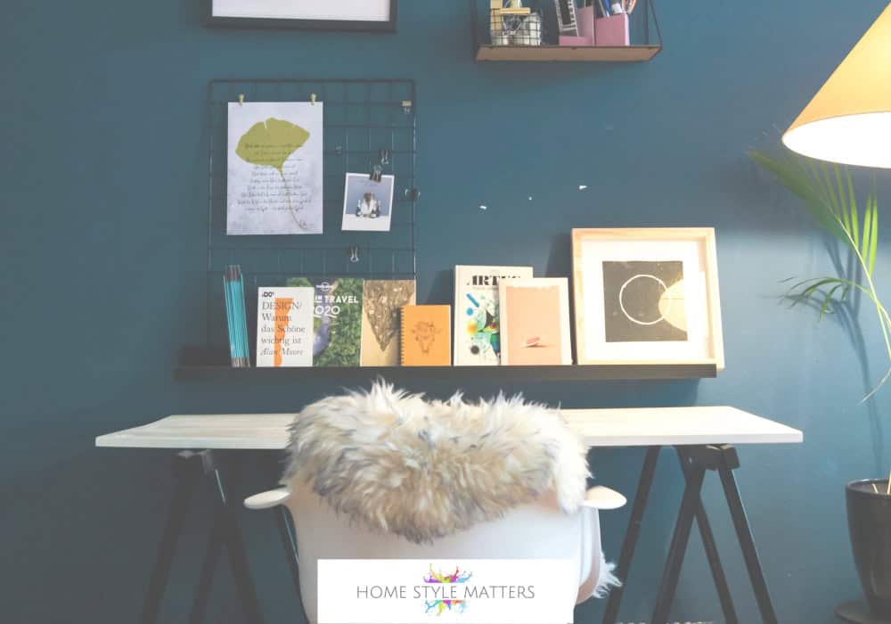
Connection to Nature & Cosiness
The 2026 colour movement reflects a shift toward warmth, comfort, and cosiness. Deep Teal and Navy echo the earthy grounding of sea and sky, while atmospheric Blues with Violet undertones bring mystery and adaptability.
Earth Tones Will Dominate
While predictions suggest that earth tones could dominate—including Terracotta tones, Muddy Green, Beige, Warm Neutrals, and Brown—they may often be paired with Moody Blues to make a colour scheme that feels balanced and adaptable.
Balance of Bold & Neutral
By blending Moody Blues with Neutral paints such as Butter Yellow, Grey, and Beige, interior designers create colour combinations that feel on-trend but still timeless.
Creating a Colour Palette: How to Use These Paint Colours
| Shade | Effect | Interior Applications | Best Pairings |
|---|---|---|---|
| Deep Teal | Luxurious, grounding | Accent walls, cabinetry, bedroom headboards | Brass, Warm Colours, Terracotta, Woodwork |
| Navy | Classic, restful | Libraries, hallways, living rooms | White trims, Burgundy, Indigo, Muted Gold |
| Atmospheric Blue (Violet Undertones) | Dreamy, punchier, creative | Ceilings, offices, bathrooms | Lilac, Brighter Shade Pastels, Silver |
Use colour drench techniques (painting walls, woodwork, and ceilings in one shade) for drama. Pair with natural textures for home decor that feels restful and connected to nature.
2026 Colour Palette and Paint Trends
The colours of the year 2026 are apparently already appearing in collections. These palettes balance bold drama with softer neutral shades. For example:
- Dulux colours of the year highlight Deep Jewel tones paired with Muted Neutrals.
- Benjamin Moore showcases Navy with Terracotta tones for cosy but elegant living spaces.
- Sherwin-Williams includes Heritage Blues and Teal in its trend predictions.
Together, these industry experts confirm that paint trends for 2026 move towards muddier tones, jewel-inspired palettes, and on-trend combinations of earthy warmth with cool tones.
Interior Designer Tips for Using the 2026 Colour Scheme
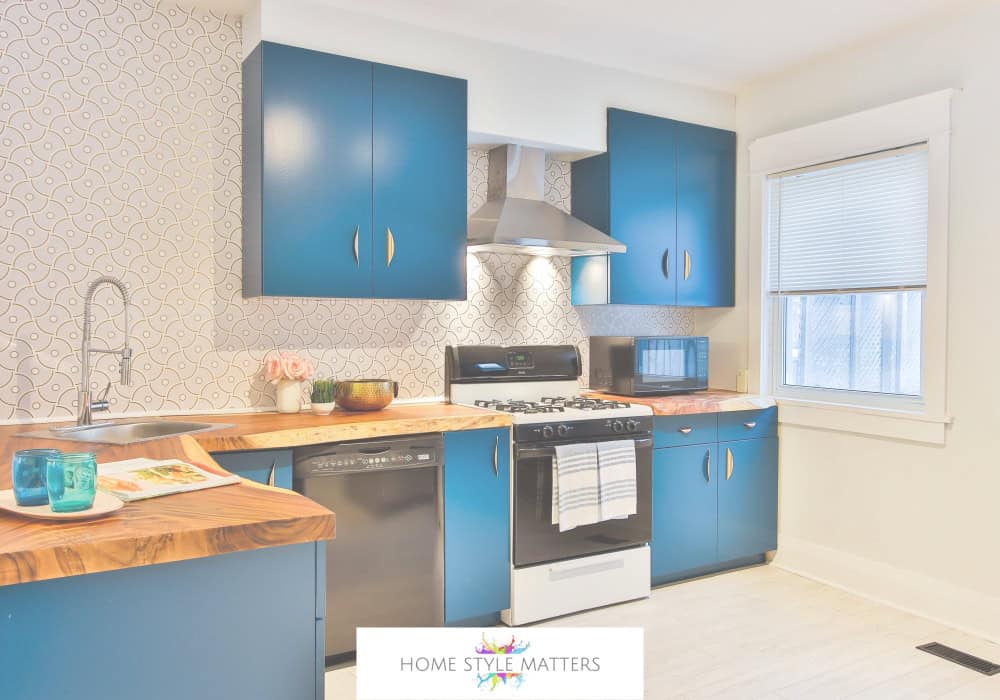
- In Bedrooms: Use Navy or Teal for a cocoon-like feel; soften with warm neutrals for balance.
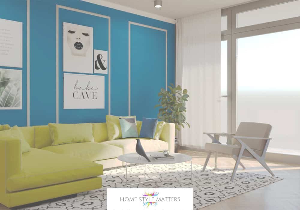
- Living Spaces: Pair atmospheric Blue walls with Terracotta tones, Beige, or Woodwork for depth.
- Accent Walls: Create drama with a single paint color, then freshen the palette with lighter shades.
- Colour Drench: This 2026’s boldest technique lets one shade envelop the entire room for intensity and cosiness.
Why This Design Trend Matters
The 2026 colour trends are not just visual styling. They reflect a move towards stability, connection to nature, and comfort in uncertain times. From home projects to real homes, these paint colours could prove to be popular in 2026 because they feel grounding, cosy, and adaptable while still adding drama.
Conclusion
The 2026 Blue colour palette set, anticipated to dominate interior design, offers the perfect balance of classic and contemporary as well as a profound understanding of how our surroundings influence our mood and lifestyle. This trend highlights the importance of balance, blending natural shades with bold elements to create emotionally uplifting spaces. By incorporating these trending colours, you can elevate your living spaces and make a statement that resonates with your personal style, which feels both bold and timeless.

