Valspar’s top tips to style Pantones Colour of the Year
Each year, the Pantone Color Institute announces its Colour of the Year, setting the tone for fashion and design, interiors, and even lifestyle trends. For 2025, the color of the year 2025 introduces a versatile and elegant hue designed to bring balance, comfort, and creativity into our homes.
Partnering with paint brand Valspar, this standout shade can be easily adapted into your interior design, whether you’re seeking a subtle refresh or a bold accent wall. Here’s how to style the colour of the year and embrace color trends for 2025.
Why Pantone’s Colour of the Year Matters
The annual color of the year is chosen by global color experts at the Pantone Color Institute (Pantone). Their choice influences design trends across industries, from interior design to product development.
For the year ahead, the 2025 color of the year embodies a calming and relaxing quality, pairing well with both neutral and earthy tones. It’s a versatile color that reflects a growing desire for a cosy, more restful home environment.
Styling the Colour of the Year with Valspar
Valspar’s design team, led by their Director of Color Marketing, highlights how easy it is to integrate this standout shade into your interiors. Whether you’re inspired by Pantone’s announcement or looking for new design inspiration, Valspar’s wide color collection offers endless possibilities.
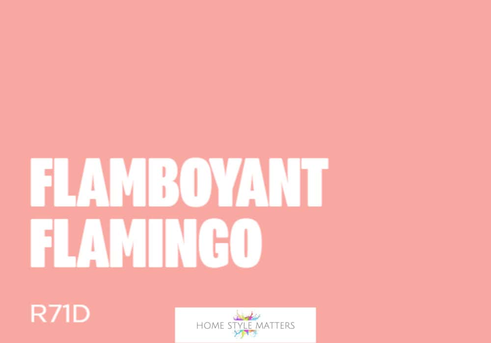
Flamboyant Flamingo
To brighten up your home with this on-trend hue, opt for Valspar shade ‘Flamboyant Flamingo’. Whether you’re looking to create a statement feature wall, decorate an entire room or add a pop of colour with furniture, this shade has the power to transform dull living spaces.
Pair with complementary creams such as ‘Ode to Joy’ or ‘Sahara Dust’, or go bolder with orange undertones like ‘Sunset in Provence’. Together, they create a colour palette that feels cosy, calm, and sophisticated.
Valspar has over 2,000 pre-set colours and offers their paints in Premium Blend v700 Walls & Ceilings, £28 for 2.5L, available from B&Q stores nationwide, www.valsparpaint.co.uk.
Create Balance with Neutrals and Earthy Undertones
The colour of the year 2025 works beautifully with neutral and earthy shades. Think sage, muted terracottas, and soft greys for a colour palette that feels grounding.
Pair with natural materials such as wood, rattan, or linen to achieve a calming and relaxing effect.


16 Comments
Sarah Stockley
January 21, 2019 at 5:46 pm
I LOVE coral, it is such a vibrant colour! It goes so well with the Sahara Dust colour, I think I would also pair it with a cobalt blue.
Sabina Green
January 22, 2019 at 1:55 pm
Oh yes it would look amazing with Cobalt Blue, very Mediterranean.
Sonia Cave
January 21, 2019 at 7:18 pm
We painted our lounge in a similar colour in our first home. It was so warming and cosy. Love vibrant colours like these for homes
Sabina Green
January 22, 2019 at 1:55 pm
We had a very similar colour in our kitchen in our first home and I loved it.
absolutely prabulous
January 22, 2019 at 11:46 am
Well you know you’re old when you’ve seen every trend in fashion, home decor and general culture come in at least twice!! I did coral in my bedroom of the first London property I bought when I still lived in the UK in erm *cough* the late 90’s. (Our little secret!) It really is SUCH a happy colour isn’t it?
Sabina Green
January 22, 2019 at 1:56 pm
Haha I love your comment, I will keep your secret shhh 😉 I agree, it’s a very happy colour x
loopyloulaura
January 22, 2019 at 10:26 pm
Ooh I want to see what Sunset in Provence looks like on a wall, it looks like such a warm colour on screen. The other 2 colours look more muted so would suit most properties
Sabina Green
January 24, 2019 at 1:42 pm
I get so excited when I see such lovely warm colours, I would love to be an interior designer – it would surely be cheaper than redecorating your own home every time don’t you think?
Michelle Murray
January 23, 2019 at 6:22 am
I love the colour Coral. It always looks and feels so warm and inviting
Sabina Green
January 24, 2019 at 1:42 pm
It is such a warm colour and goes well with other palettes too 🙂
Wendy
January 23, 2019 at 5:35 pm
Wow! I really love coral but would never think of painting my walls that colour, it looks amazing though xx
Sabina Green
January 24, 2019 at 1:43 pm
I think it would look lovely as an accent wall x
Amy – All about a Mummy
January 23, 2019 at 6:43 pm
Oooo coral is so pretty. I hadn’t thought of putting it on the walls. Certainly makes a statement!
Sabina Green
January 24, 2019 at 1:43 pm
It does, doesn’t it? I used to have it in my old kitchen on one wall and it looked great.
Amy – All about a Mummy
January 23, 2019 at 8:24 pm
I never thought of putting coral on the walls but it looks fab! So vibrant.
Sabina Green
January 24, 2019 at 1:44 pm
Sometimes we need a little vibrancy in our lives 😉