Colour Combination for Interior Design
Table of Contents
A well-thought-out colour combination is at the heart of every successful interior. Whether you’re redecorating a single room or planning a full-scale renovation, choosing the right palette is crucial for creating a space that feels cohesive, inviting, and tailored to your personality. Let us explore essential interior design principles, from color harmony to practical colour schemes for your home, with tips to help you find the perfect palette.
The Power of Colour in Interior Design
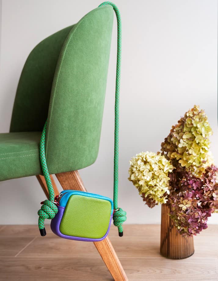
In the interior design process, colour plays a transformative role. It defines mood, enhances architecture, and even influences how large or small a room feels. A well-executed colour scheme provides a cohesive color flow throughout your home, supporting a smooth visual transition between different spaces.
Experienced interior designers often emphasize the importance of aligning your colour palette with natural light sources. A south-facing room with strong daylight, for example, may benefit from cool blue or subtle green shades, while darker rooms can benefit from light gray, pale blue, or soft sage to maintain brightness.
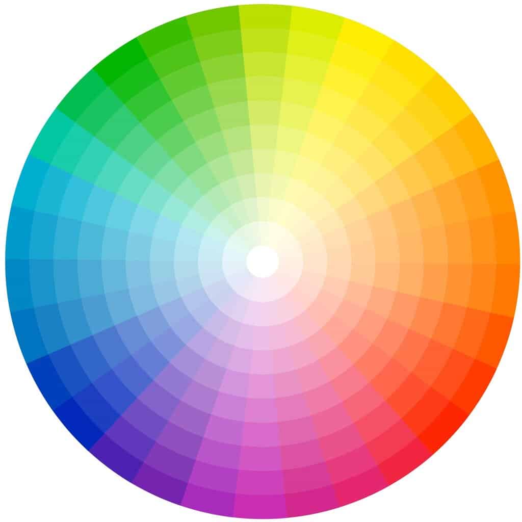
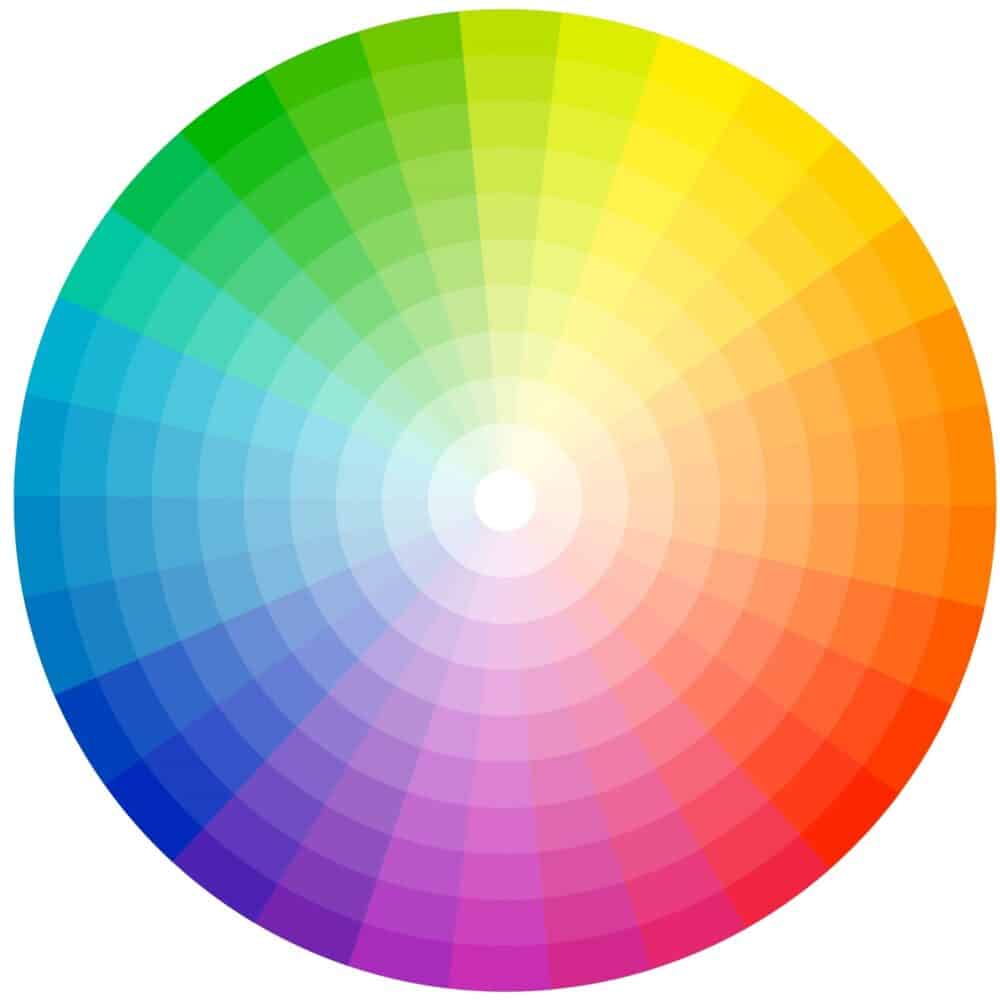
To create a successful interior, you need a basic understanding of color theory. This involves learning how a shade relates to the colour wheel and applying them to form harmonious interior design color schemes.
Key Concepts:
- Comparable colours: Shades next to each other on the wheel, such as blue, soft blue, and green, which offer a soothing and cohesive effect.
- Complementary colours: Opposites on the wheel, like red and green or blue and yellow, creating bold, high-contrast pairings.
- Triadic and Tetradic schemes: Using three or four hues evenly spaced around the wheel, forming an equilateral triangle if lines are drawn correctly to bring balance and depth.
Popular Colour Palettes and Schemes for Interiors
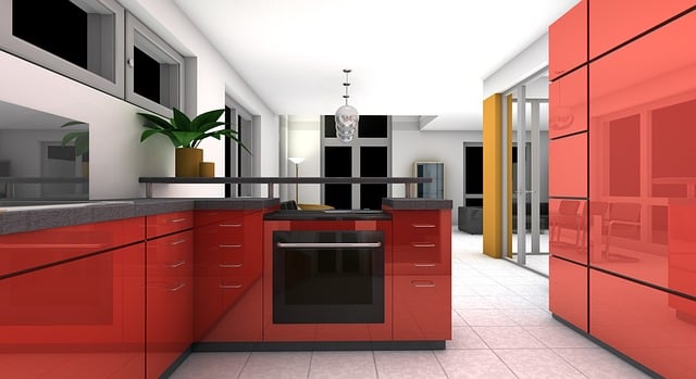
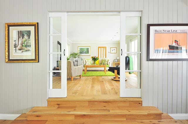
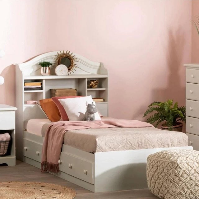
Finding the right colour palette means balancing functionality with style. Here are some tried and tested schemes to inspire you:
1. Neutral & Timeless
A neutral base built with beige, taupe, light gray, and off-whites allows you to layer textures and accent colors easily. These tones feel airy, versatile, and work well in different strengths for both minimalist and cosy interiors.
2. Earthy & Organic
Inspired by nature, earthy tones like terracotta, ochre, and subtle green bring warmth and comfort. These work well with natural textures and are perfect for home office setups or guest bedroom designs.
3. Bold & Jewel-Toned
Think jewel-toned shades like emerald, sapphire, and ruby. These rich and deep colours exude elegance and offer a feeling of luxury. Pair them with muted neutrals or gold accents for a sophisticated edge.
4. Playful & Punchy
Love to play with color? Try pink with red or white, or teal and coral. These bold combinations bring energy to children’s rooms or creative spaces. Even blue and red, when balanced carefully, can work well together.
5. Classic Complementary
You can’t go wrong with complementary colors like yellow and violet or red and green. These high-energy contrasts are best used in moderation with a strong dominant colour and a secondary accent shade.
Expert Tips to Find the Perfect Color Palette
Start with a Dominant Colour
Choose one main shade to anchor your space. This will guide your color choices across furniture, paint, and accessories.
Use the 60-30-10 Rule
Apply your dominant colour to 60% of the space, a secondary shade to 30%, and an accent color to the remaining 10%.
Watch for Undertones
Be mindful of undertones—even neutral hues can lean warm or cool. Test paint swatches under natural light before committing.
Reference Trusted Brands
Brands like Little Greene offer curated paint colours that work within the same family, ensuring harmony.
Take Inspiration from Interior Designers
Noted interior designer Anna Haines often uses Oval Room Blue or golden yellow in her work, which blend tradition and trend with flair.
Conclusion
Whether you lean toward neutral tones or bold, bolder contrasts, choosing a colour combination that supports the function and feel of your space is key. A carefully selected color palette can unify two spaces, elevate mood, and enhance flow. Trust your instincts and never be afraid to experiment with paint and paper. With the right knowledge and a touch of creativity, you can confidently find the perfect color palette to bring your vision to life.


